Analytics Dashboard
New eyllo Interface for Data Analysis
With the release of the June 2023 version, we at eyllo are pleased to announce a new interface for presenting business intelligence data. This new interface uses a new hierarchy and new layout for a more improved visualization of operation data.
The new data presentation interface takes the analysis experience to a new level. We designed a new chart organization layout to offer a more intuitive experience, with a design that allows exploration and understanding the data presented more efficiently. We developed a new layout, designed to provide a visually appealing and harmonious experience. With a consistent and standardized design on all pages, interaction with data becomes more fluid and natural.
A New Hierarchy for Improved Data
We have embraced innovation in the activities we develop. When we decided to update the presentation of business intelligence data, we held several meetings and collected the relevant information for each of the graphs presented. We created some visualization options and measured the results. With the data collected, we interactively refine our proposal and design. At the end of the process we were able to offer an interface that transcends expectations. The new layout was designed to offer more than a simple visual refresh; it is a complete evolution in the way data is presented and interpreted.
Main Highlights of the New Interface:
Intuitive Experience: Each element of the new interface has been carefully thought out to provide a more intuitive experience. Effortlessly navigate data, with a layout that naturally adapts to how you work.
Visually Appealing Design: Pave the way for more engaging analysis with a visually appealing and harmonious design. Modern aesthetics are not just cosmetic; it is an intrinsic part of how we make data easier to understand.
Consistent Standardization: Maintaining consistency across all pages, our new layout ensures fluid and natural interaction. Every click is a frictionless journey, allowing you to focus on what really matters: extracting valuable insights.
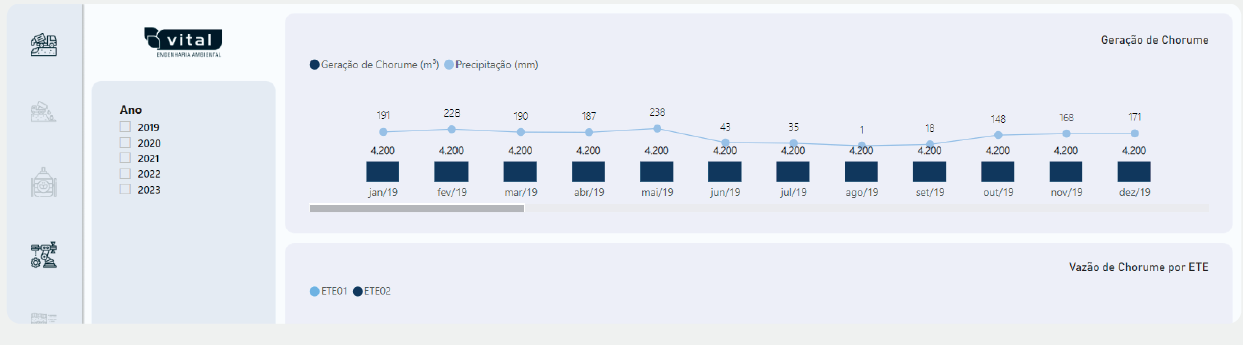
Previous Layout
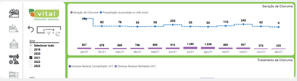
Improved Layout
More than Meets the Eye
Improved Efficiency: The new layout is not only aesthetically pleasing; it is designed to improve efficiency in data analysis, saving you time and effort.
Easier Exploration: Dig deeper into data with ease. The new interface structure allows for deeper exploration, providing detailed insights with just a few clicks.
We are excited about the arrival of this new era in data analysis. eyllo continues to lead the way, offering not just a tool, but a transformative experience.